
“You are a mind reader. This is absolutely what I was looking for.”
Alexander Blyth – Megazip Adventure Park Founder, Singapore

For the launch of Singapore’s first adventure park Megazip (now rebranded to Mega Adventure), we worked closely with the owner and his team to create the branding that would introduce the park to future visitors.
After experiencing the park firsthand——during its final stage of preparation, when it was open only for select “test pilots”——it became clear that the inspiration for the visual identity should be derived from the lush surroundings of Sentosa Island and the exhilarating thrills Megazip offers. The park had one of the longest and steepest zip wires in Asia, a 12-meter-high ropes course, a free-fall parachute simulator, and a challenging climbing wall. We shot videos and photographs of the activities, especially focusing on 360° panoramas that would be used for an interactive tour of the park on the website and in all promotional materials (outdoor banners, brochures, flyers, tickets, etc.).


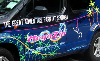
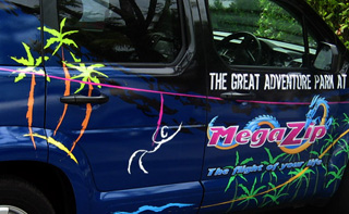 Vehicle livery detail
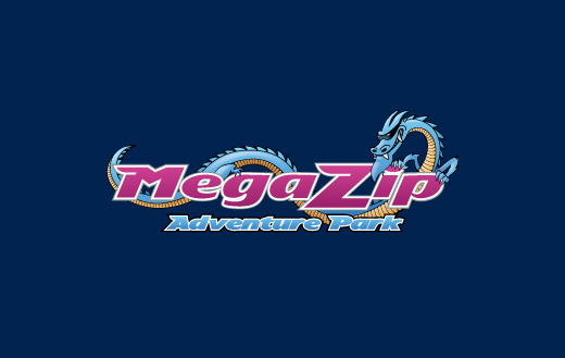
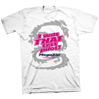
The existing logotype needed a redesign and bit more character, so we came up with a dragon character – that would act as the park mascot and also represent the attitude of the brand. We agreed on the color scheme, based on the owner’s preferences, Asia’s favourites and Sentosa’s regulations.
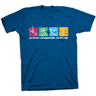
The owner also needed a separate illustration that would explain why this zip-ride (their main attraction) is so special, so we came up with this minimal stick-man figure that is enjoying the zip-ride from the top of the hill, over the canopy and the water, to the small island at the end. From this simple illustration we were inspired to create a whole set of icons that would illustrate all the various activities on the website and in all promotional materials. This was a great way to sub-brand the individual activities of the park and also give a graphical counter-point to the photos with line and color.
For the website, we worked closely with the owner’s team to define all the details in the graphic design (extreme sports typography, concept and content).
The launch was a great success and since then the company has rebranded to MegaAdventure and expanded it’s operations to new locations in Australia.

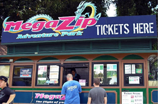
Ticket booth 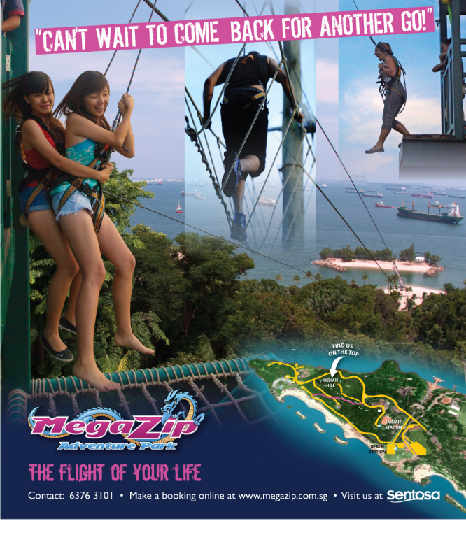
Advertisement 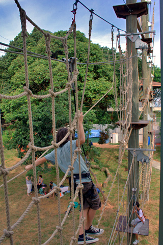
Photography of the high ropes course 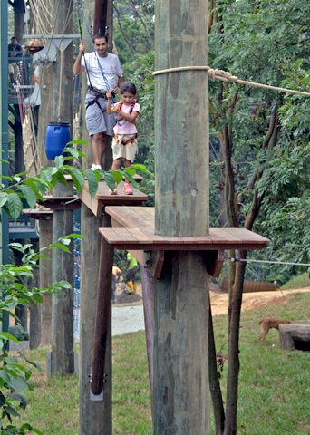
Photography of the high ropes course